5 Home Items to Ditch If You Want to Be More Stylish
Sophie Miura | October 23, 2017

Styling a home is much like putting together an outfit. Some people just seem to have a knack for combining pieces that look effortlessly cool while others struggle to pinpoint what's lacking. If your home is missing that certain je ne sais quoi, Dan Mazzarini, founder of interior design collective BHDM Design, says there are few aspects worth considering.
"The first is good art—there is so much good art in the world, and not all of it is expensive," he says, noting it's the number one thing he notices when he walks into a home. As for what lets down a well-styled space? Clutter is the biggest culprit. "There is a difference between curation and collections, and clutter. Avoid the latter," he recommends.
So what sets stylish homes apart from the rest? Ahead, we quizzed Mazzarini about the most transformative items in each room—the accessories that instantly elevate a space and the ones that let it down. Here's what an interior design pro notices first when he walks into a room:
1. Ditch: Mudroom Clutter
Add: Art or a Mirror
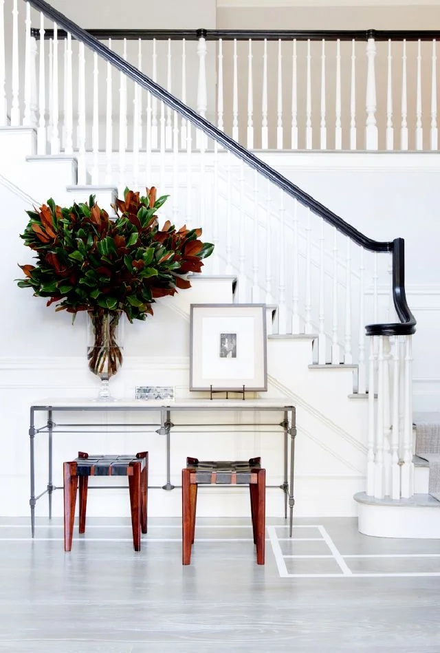
When space is limited, it's easy to treat your entryway like a mudroom, but Mazzarini says this is a mistake. "Your entry should feel welcoming, and clean. I love signs of life (keys, books, a great bag), but I don’t like when people treat their entry as a mudroom catchall. Put shoes and mess away!"
If your entryway is lacking, he says one statement piece makes all the difference. "I think a piece of art or mirror is really great in an entry. It's a way for you to give a great first impression of your style or the last look before running out the door. Either way, they should be a statement. I like something with unexpected scale, either big or small."

West Elm Frameless Asymmetrical Wall Mirror ( $199 ) ($149)
2. Ditch: Generic Rugs
Add: Furniture in Different Décor Styles

If there's one decorating faux pas that undermines a living room, it's a poorly chosen rug. "Sometimes rugs are prioritized as 'needs to be soft' or 'pet/kid friendly,' and style gets sacrificed," he says. "There happen to be a lot of really great and livable rugs on the market—the one in this Californian living room is actually indoor/outdoor: It's sleek and stylish while still being pet- and beach-friendly."
When designing this space, Mazzarini was careful to veer away from matching furniture, which can look predictable. "Here, we also mixed styles. The vintage-inspired coffee table and primitive bench are a little 'crunchier,' and the custom cerused oak end tables are in a more deluxe finish. The mix is what made this feel more California casual," he points out.
If you want to style multiple wood items in your home but aren't sure what shade to choose, consider the overall aesthetic goal first. "There is really no hard set rule here, but I think the more 'matching' wood species actually are, the more formal a room feels. There's something about the bit of mix—even in this room—that shakes it out a bit."

Eric Trine Rod+Weave Chair
3. Ditch: Unnecessary Accessories
Add: A Seasonal Throw

Nightstands are functional, but Mazzarini says they shouldn't be a place to dump all your accessories. "I love when a bedroom feels like a great boutique hotel room. Not too many and just the right accessories help with this," he says. "We like to outfit rooms with little bowls (for keys, earrings, watches, phones), a glass carafe for water, always fresh flowers, and a place to inconspicuously charge a phone."
He also says a well-made bed can work wonders to elevate your bedroom. "I love a striped, herringbone, or tone-on-tone patterned cotton throw for summer and a deluxe wool or cashmere for winter. Pull this up, two inches below the flat sheet, then fold both the sheet and layering blanket about 40% down the bed. It'll look lower than you're used to, but trust me!"
His other pro tip? Rethink the size of throw cushion inserts: "Always order your feather inserts two inches bigger than your pillow sham. This makes them look extra full."

Parachute Striped Cashmere Throw
4. Ditch: Uniform Chairs
Add: Statement Lighting

Dining rooms tend to follow a predictable decorating equation (matching statement chairs + simple dining table = done), but when Mazzarini's team decided to break the rules in this Syosset, New York, project, the result was stunning. The trick, he says, is to choose eclectic chairs based on their height and color palette. "When we do this, I like there to be a little [size] hierarchy. Think of 'head' chairs and guest chairs. You can also go all-out and make every chair different, but in that case, I recommend keeping them in similar tones (all light wood, all white, all bright painted colors)."
If you only add one accent to your dining room, opt for a statement pendant light. "We considered this room more a 'sunroom' dining room, so we wanted it to have a little indoor/outdoor quality," he explains. "This pendant was open and airy, and gave the room a more garden-y vibe, along with the light colors, metal chairs, and plants."

5. Ditch: Saturated Colors
Add: Original Kids' Art

"When we design for kids, I always like there to be a sense of whimsy, but I never talk down to them," he says. "In this weekend-house kids' room, we mixed patterns and textures that were inspired by kids drawings and finger painting—splatter-painted sheets, watercolor throw pillows, and this awesome custom scribble Roman blind are fun but not unsophisticated."
Mazzarini veered away from saturated primary colors and was instead inspired by games to create a kids room that's cool, not cheesy. "A classy checkers board was fun to use while still adding a chic pattern and color to the room," he says.
The best kids' rooms don't just look great—they also represent the boy or girl's personality and feel lived-in, not overly styled. One of the most effective ways to do this is with art. "Whenever possible, we love to frame kids' art! You'd be surprised how chic (and expensive) kids' art looks when you add a four-inch, eight-ply white mat [board] and frame. Voilà!"

ONLINE EXCLUSIVE.